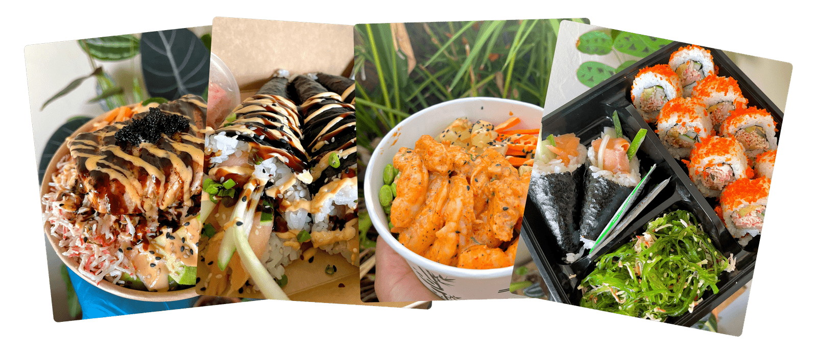
CLIENT: Sushi Plug
ROLE: Creative Director | Brand Designer
COMPANY: SOLA Creative Studio
CREATIVE PROJECT DIRECTOR | BRAND STRATEGIST: Sádé Budhlall
ILLUSTRATOR: Kahani Marri
WORK: Brand Strategy, Brand Identity, Collateral Design
As the creative director and brand designer for Sushi Plug’s rebrand, I transformed their identity from Quarantine Sushi into a fresh, modern, and locally inspired brand. The new identity highlights their use of sustainable, locally sourced ingredients, offering customers a unique and eco-conscious sushi experience. Sushi Plug’s mission to create exceptional flavors with minimal environmental impact provided the foundation for a visually dynamic and cohesive brand.


The rebrand was centered on crafting an identity that reflects Sushi Plug’s dedication to freshness, sustainability, and connection. The design integrates a harmonious blend of bold colors and custom typography with a stylized logomark symbolizing the traditions and artistry of sushi making. The elements work together to evoke feelings of community, taste exploration, and high-quality craftsmanship.
The visual identity was created with versatility in mind, functioning seamlessly across digital and physical mediums while maintaining its vibrancy and clarity.

The Sushi Plug rebrand revitalized the brand’s presence, positioning it as a high-quality, sustainable sushi provider with a strong local identity. By creating a versatile and visually dynamic identity, the rebrand reinforced Sushi Plug’s commitment to their customers and the environment.
This project demonstrated the power of thoughtful design in transforming not just a brand’s image but also its impact. The result is a vibrant and modern identity that speaks to Sushi Plug’s dedication to quality, sustainability, and community.